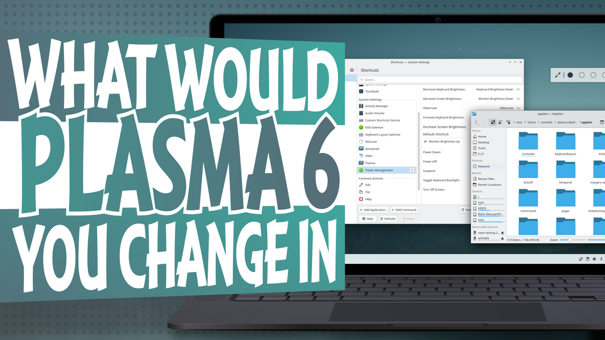
What would you change in KDE Plasma 6
I've heard a lot of people saying what they would like to see in Plasma 6 and - as much as I do want 6 to be awesome and perfect - not everything can be fixed or implemented, far from it. However, there's something very easy we can do. Like, very very easy. And that's changing defaults.
So, today I do want to throw at you a bit of a challenge: if you were a KDE Developer, and you had literally no time to implement a new feature or fix any bug, but you could only change the defaults... which defaults would you change for KDE Plasma 6 specifically? It's not an easy question if you think about it, but I'll attempt at giving my personal - and, very debetable - answer.
As a way to give you a bit more freedom, I will also allow removing features along changing defaults.
Take Off Activities
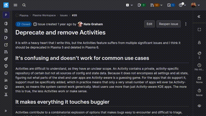
I'll start with something extremely controversial, and I'll also cheat a little bit. The first thing I would personally do is remove Activities , for various reasons. Now, it's not technically "changing defaults", but I feel like at least removing the buttons to access activities is easy enough, worst case scenario. But... why?
Personally I do not feel like Activities currently work: they are very buggy and unreliable, and I would prefer to not offer a feature rather than offer a very buggy and unreliable one. Every once in a while, somebody proposes formally to remove activities, and somebody else says "no! instead of removing, let me fix them!"; usually, that leads nowhere, because activities are super complex and fixing them would require a lot of effort.
That said, currently there is interest in "fixing" activities, though if I understood it correctly it would be more like significantly re-work how they work. There's discussions, even happening these days, and probably we'll talk even more about it during KDE Plasma sprint in early March, but I am still a bit skeptical. I would love to be proven wrong, though.
Use a Floating Panels by default
What's next? I would like to use, by default, the floating panel . If you follow my channel you know that I recently finished a merge request that makes the panel de-floating prettier and adds shadows to them, which is nice, and I think now it's nice and usable enough to be used as a default. This, I think, is especially true if you consider that the floatingness is adaptive, so the panel will look absolutely normal whenever a window is touching it. I know it's not something for everyone, but I do think that it could be worth it.
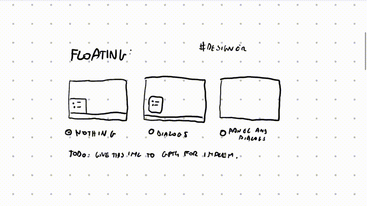
Maybe Floating Dialogs by default?
Next up, I'd also like dialogs to be floating , though I'm much less sure about this than the other stuff (especially if you consider that I do not have a fully finished merge request for this feature, but it's basically ready, I can promise you'll have that in Plasma 6 as an option). There's actually a quite long history on the implementation of floating dialogs because they always felt like a nice feature to add, for those who wanted it, but there's been a lot of discussion on how this could be implemented and shown to the user. I actually have some early mockups , made by the great KDE designer Manuel, showing some possible indicator designs. The thing is: actually adding any kind of indicator to a floating dialog - be it an arrow, or anything else - is actually super complex, especially because it also has to deal with transparent-by-default third party themes.
So, when implementing this, I tried to go for the easiest possible way, which is to just have floating dialogs without any indicator, and then we can see how it goes from there. And, honestly, they're pretty and I would use them by default; I said it. Now, I haven't decided how the UI should be to turn these on, but I'm working on it. So, yeah, please tell me in the comments if you would use this feature, and if you'd feel fine with having it enabled by default.
More Colors!
With the amazing release of 5.25, a lot of colorful features were introduced. And they are seriously amazing, but they're also quite hidden into settings; I think it would be great to better expose them to the user, but I also think that we should just start using them by default. Take the accent color: usually, it's just blue, and that's it. Blue is pretty, buuut, you change manually change the accent color and you can even make Plasma automatically choose it from the wallpaper. That's the option I would go with, by default. There's been lots of work to make sure the accent color generator always produces good colors, and now we should make use of that functionality, I think.
Then, always talking colors, we have the fact that we can tint the header area of any window with the accent color. This is how it looks right now and even though, yeah, it's fine, I don't think it's appropriate by default. However I did see lots of talk on how this could be improved and if the tinting was a bit better, then, why now? This could be another way to make Plasma prettier. However, before adding this one to my final list, I'll just wait until the option is improved a lil' bit.
Then, we of course have window tinting! That's amazing too! Basically, the whole window becomes tinted, by a tiny amount, with the accent color. It allows windows to blend in just the right amount with the rest of the look and, I don't know, it's just perfect. I would really suggest that you all enable this feature and then tell me how strong you like your tinting: just a little bit? a normal amount? or a loooot, like me?
More Blur!
Another thing that's very very well hidden is the fact that you can add blur behind context menus. This used to be quite buggy, but I think most of those issues were fixed with time. And, to be honest, why wouldn't you want to have blurry context menus?
As a bit of context, I've spent my first year in KDE working on a patch (which, seriously, took a year or so :P) to make the KDE Plasma theme more blurry by default; and it did land. If you have contrast effect enabled, you should see that the colors from your wallpaper get into the dialogs and tint them in a pretty way, especially with a dark theme. So I would say Plasma is really modern there.
Done that, I started advocating for adding blur to other places too. I asked for it on the header of applications, at least as an option, but apparently that's not very easy to implement at all. I also tried to make Konsole a bit transparent and blurry by befault, which was also rejected due to reasons I completely forgot about.
So, now it's time for me to say: hey, what if we made context menus blurry by default, at least? Because, apparently, I'm the KDE Blur guy. And I'm fine with that.
Use the Breeze Locally Integrated Menu
Another thing I would love for KDE is to land the Locally Integrated Menu on Breeze. Let me start off by saying, though, that this will NOT happen, for various reasons. There are some technical problems and such that won't allow this feature to be "turned on" by default, and it's not quite a change of a toggle here, but this was actually already implemented by other developers so it should be just a matter of upstreaming it, even though, again, that's not going to happen.
I feel like the locally integrated menu saves some useful space from the window and doesn't have big drawbacks, though that's clearly subjective. It's something that Unity did out of the box, and I do think that it worked, and I do think that a similar design could work for KDE Plasma too. However for this one I would really appreciate if you have some feedback, not to decide whether to upsteram this feature or not (again, not happening), but really, I'm curious to see what y'all think of it.
One thing NOT to change
Whilst we're talking about things that I would change, let me tell you about a feature that I would prefer not to change, but I do realise that stronger forces are in play here, so it might, indeed, change. Single click by default. I think that opening folders and files with a single click is clearly the best way to do things and this double click to open is just a relict from the past and we should get rid of it as soon as possible because it's going away anyway. I'm going to make a wild prediction here: if KDE switches to double click to open folder and apps, then - eventually, and we're talking years and years in the future - we will be forced to switch back to single click, because that's where everything is heading, in my - very subjective - opinion.
Layout of applets
Oh, by the way, Plasma 6 would be a good time to change where we place applets, if we want to do so. As an example, I personally really like the idea of adding simple separators to the left and right of the system tray -- like this. Again, this is something super easy to implement, and that would require basically zero developer time. Also, I shouldn't say this, but I do feel like centering the task manager and kickoff icon isn't that bad of an idea. The only reason why I would never support this change, even though I like it, is that it would make people say "oh, you're trying to copy windows 11"; now that microsoft has decided to have a centered task manager, I guess that KDE keeping it on the left is going to help distinguish the two desktops. It's weird that we have to do that given how wildly different we are from Windows 11, but hey, whatever floats your boat. I would also love a clock widget that's a bit more powerful and shows you, as an example, the weather and allows you to create events. Given that this video is all about not requesting new features, though, I will point out that we can achieve that simply by swapping our clock applet with the one made by Zren, called Event Calendar. It's awesome, and you should try it out, and I wouldn't be opposed to the default calendar widget gaining some of its features.
Inactive Blur
Lastly, let me put in another thing that's never happening. Like, ever. I would absolutely love for KDE to use the "Inactive Blur" plugin - which, by the way, is broken on the very latest version of KDE Plasma, sadly enough, so that would have to be fixed before being actually able to upsteram the functionality at all. The Inactive Blur plugin, if you haven't heard me ramble about it yet - if so, wow - simply blurs your wallpaper whenever you focus any window. It creates a depth of field effect that I totally love AND... if I were allowed to ask for more feature, I would actually love for a proper depth of field functionality (probably as a Kwin effect) that blurs all windows below and above the selected one, as if you were looking at that window and there was a bokeh effect on the others. I think it actually helps distinguish what's above, what's below, and what you're looking at.
Outro
But that was just my ramblings and things I would change. Now, I would like to hear yours. Similarly to mine, it's likely that most of them will not be implemented in PLasma 6 or any version of plasma, because life is also a compromise sometimes. But still, I voicing your opinion allows developers to see, you know, what people think of things, and how they could be improved. It's useful, and you should totally do it.