GNOME 46: What's Up?
You might have heard that GNOME 46, code-named "Kathmandu", is now out. It brings several changes that may be subtle, but are very welcome nevertheless. On top of the usual upgrades to polish and performance, this time we even get some interesting features that make GNOME more fit for enterprise environments and remote access. But that's enough for the introductions: let's get going!
What is a better way to test out a brand new GNOME release than to try it in its natural habitat? For this review, I decided to test it out on a fresh install of Fedora 40 Beta, Workstation Edition. Fedora Workstation is widely considered to be one of the better distros to run the GNOME and Plasma desktops, and for good reasons: in its default ISOs, the level of polish and integration between the desktop environment and the system itself is very high.
Setting things up
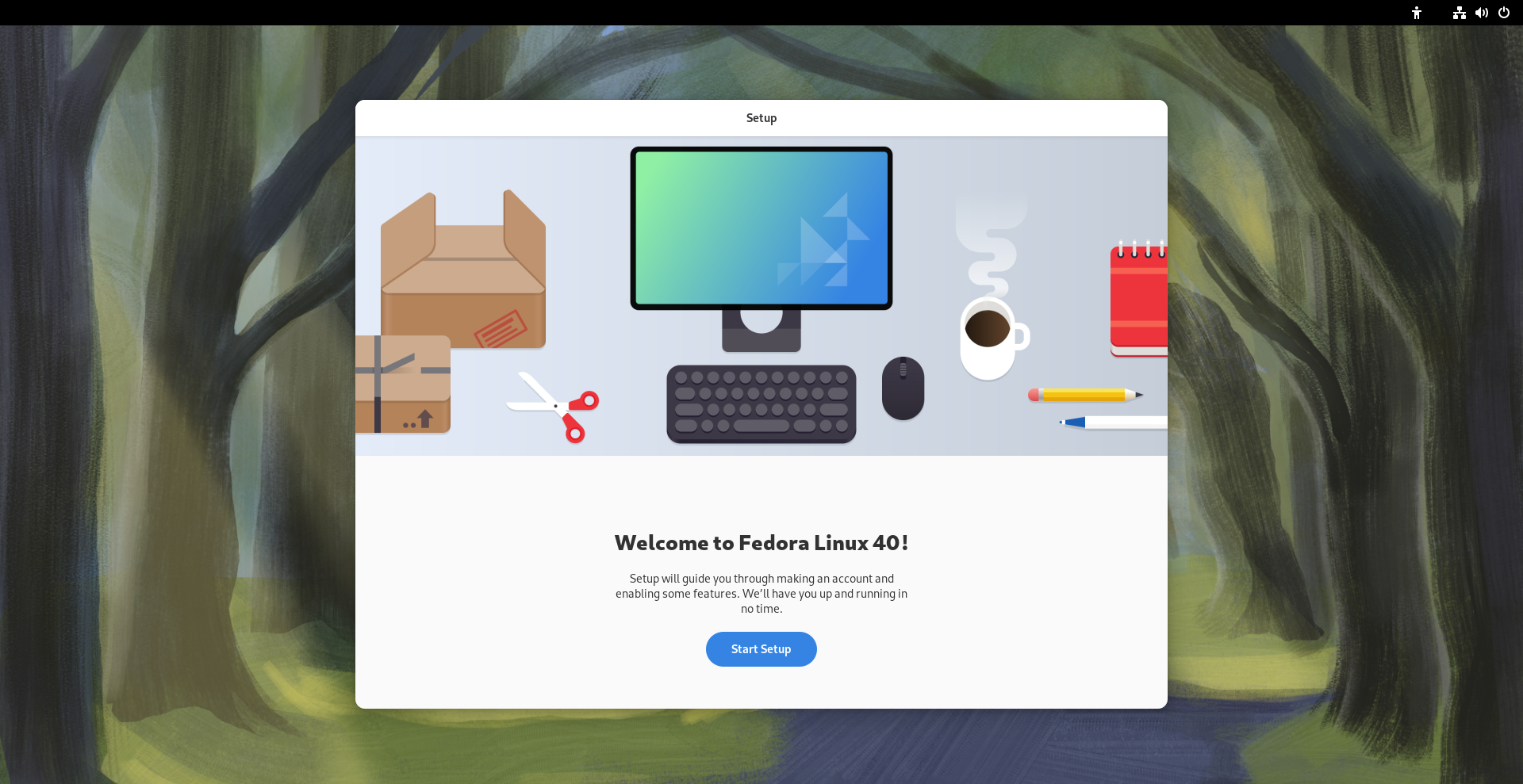
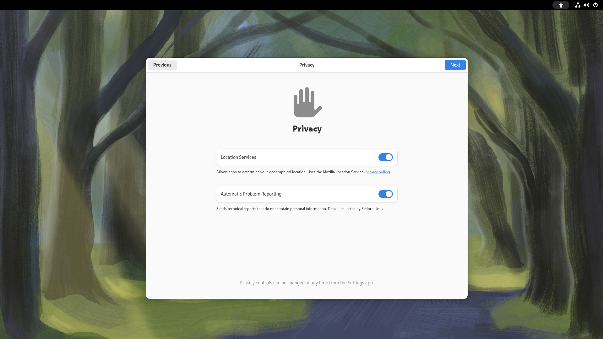
Upon starting up GNOME 46 for the first time, you are welcome by the usual first-start wizard that makes it easy for new users to get using GNOME. Only, this time, it's significantly shorter: in fact, we did not get asked to set up our online accounts! This is not a coincidence, but it's due to the fact that there has been a large rework of the GNOME Online Accounts feature.
GNOME Online Accounts
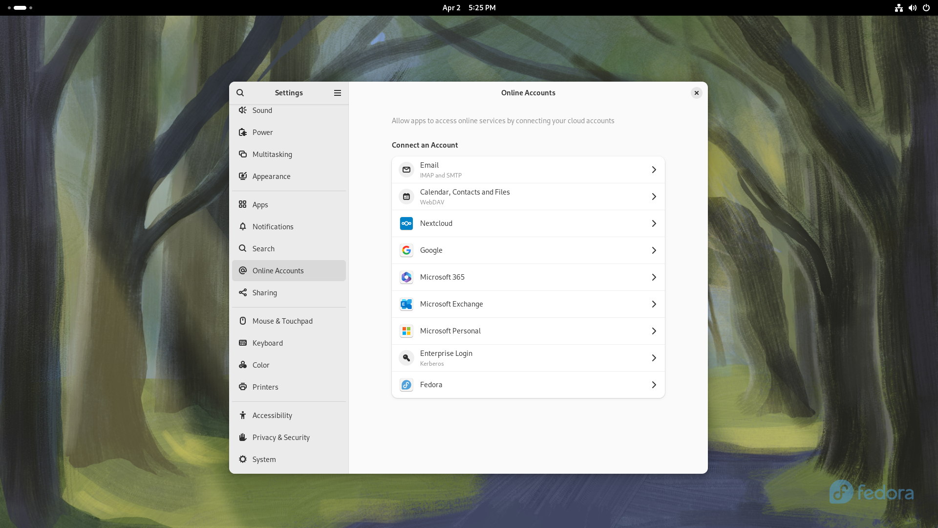
The first thing we notice is that, on top of the usual familiar faces in this session, we have tons more options for Microsoft log-in! In fact, Personal and Enterprise Microsoft services alike are now fully supported. This brings several nice benefits, one of which is the fact that OneDrive cloud access is now natively supported in Nautilus, GNOME's file manager. This is great news both for students and workers, who will be able to seamlessly tap into their organization's free OneDrive remote directory for cloud sync and seamless backups in a way that is much more comfortable than it ever was using existing solutions prior to this. The de-facto way to access OneDrive on Linux up to now has been the unofficial onedrive CLI tool from GitHub - a nice tool indeed, but one that is inaccessible to a lot of users due to lacking a GUI and an easy installation method, and one that does not integrate seamlessly with GNOME either.
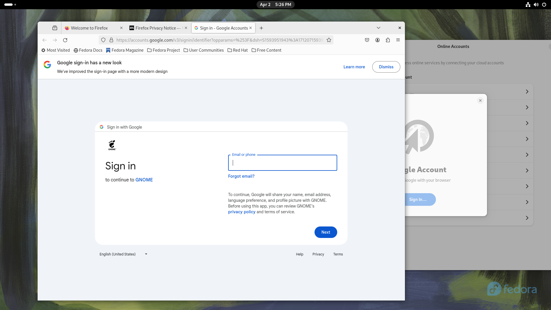
Let's now move to the reason why the Online Accounts are no longer a step of the first-time set-up: on GNOME 46, the log-in process is now done through the default browser, a change that was necessary, as it solves long-standing issues with commercial service providers rejecting login attempts done from GNOME's WebView, as well as enabling other login methods, like YubiKeys, since the user's default browser can tap into more advanced features like WebUSB to allow communication between the login page and a physical authenticator. This is obviously great news for privacy-aware folks that wish to use a Yubikey as a secure authentication method!s
And for those of you with more arcane setups, a new generic "WebDav" option has been added, allowing you to hook GNOME into any WebDav provider your heart desires.
New search
This is already a major improvement for productivity, but it's not over yet. Nautilus, GNOME's file manager, has seen several nice improvements on its searching capabilities.
Search Everywhere
Traditionally, when you start typing something on Nautilus, the file manager begins recursively looking for files and folders that may exist from your current working directory downward. This feature is super nice, and it has already received a big speed-up in GNOME 45; but sometimes it's not enough.
Nowadays, we tend to store our files across several locations: you may have the SSD that your operating system is installed on, several hard drives connected for gaming, then a couple of cloud services on top. It can sometimes prove challenging to find that one file that you just don't remember where it may be. On GNOME 46, the new "Search Anywhere" feature solved this problem!
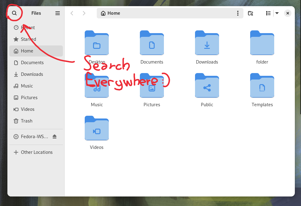
You can now begin looking for a file, no matter in what hard drive or NAS it might be, by either pressing the new looking glass icon on the top left corner, or with the Ctrl + Shift + F shortcut. Let's give this a quick demonstration:
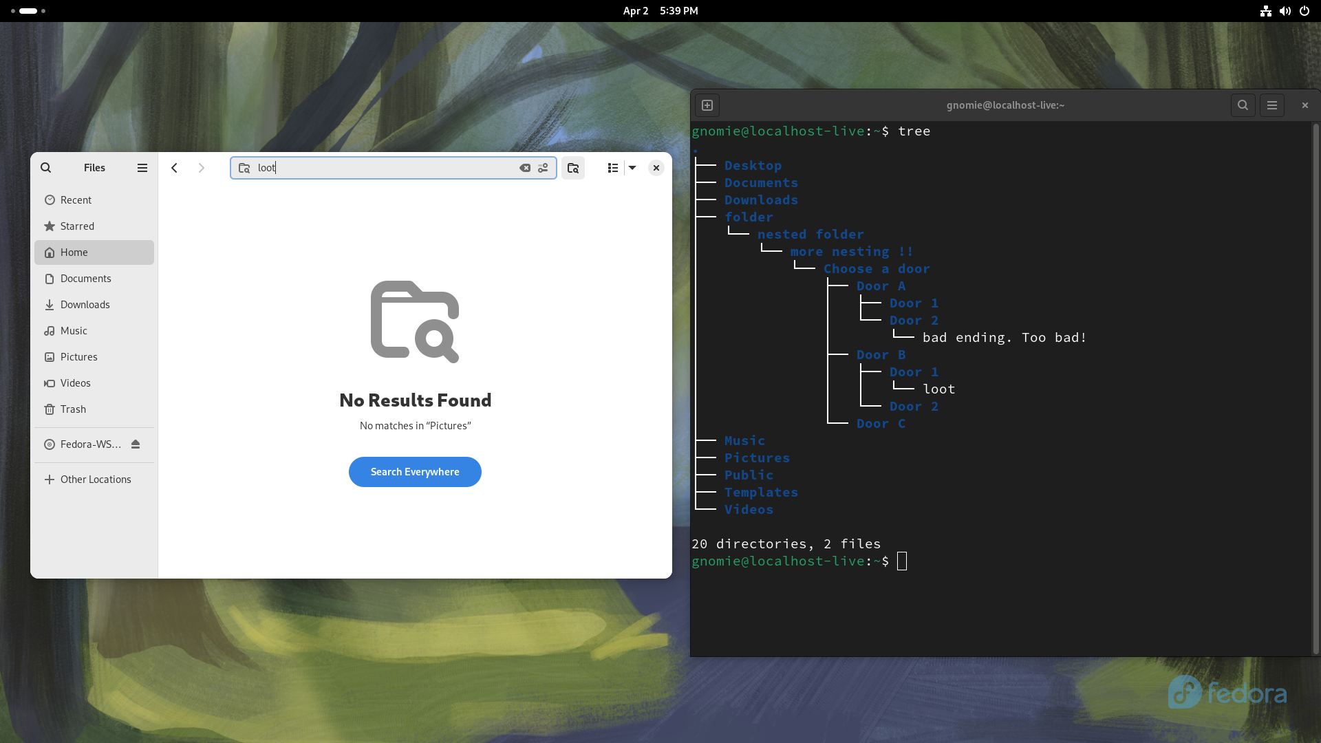
Let's say you are in the Pictures folder, and you are looking for a file called loot - small file that you left deeply nested in an arcane folder hierarchy on some drive five years ago. Naturally, if you begin typing loot from there, the search will give you no results - after all, that location is not a sub-folder of your Pictures directory.
Let's give it a spin with the new Search:
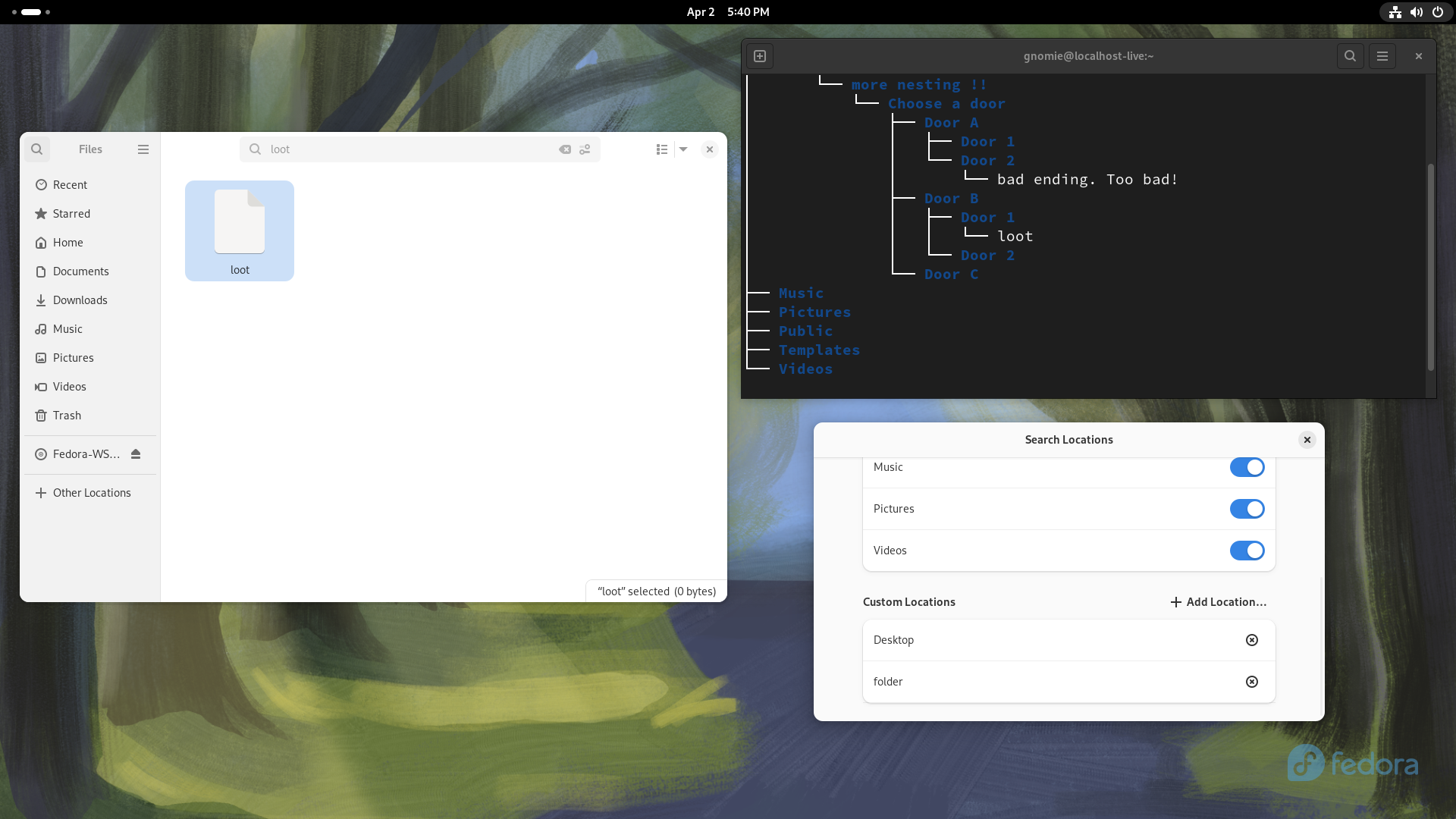
Sure enough, Nautilus will have located your file in just a split second. You can even right-click it and navigate to the location where it was and continue your hunt from there - all in a single go!
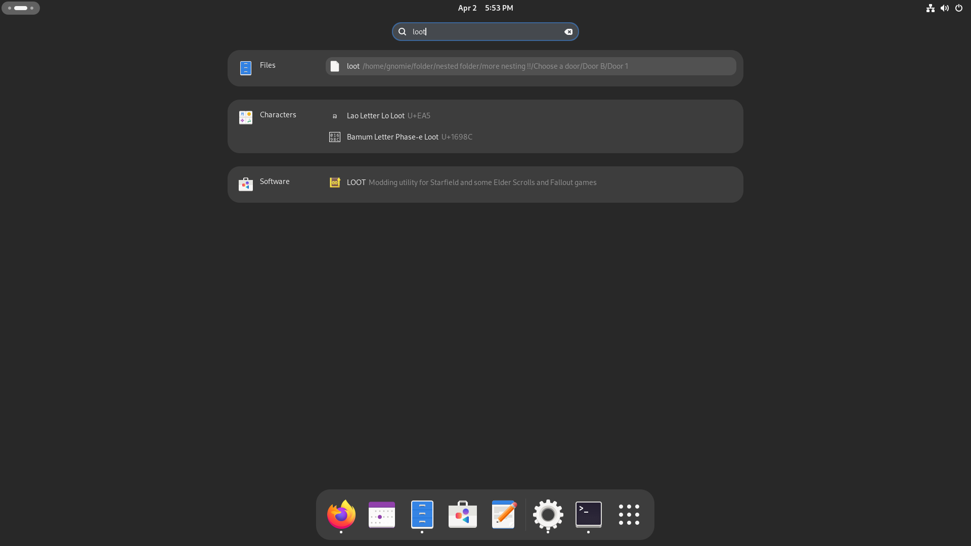
You don't even need to be in the file manager for this to work, of course: you can just press the Meta key from anywhere and start typing, and GNOME will locate your file all the same.
Revamped Files app
Better progress bars
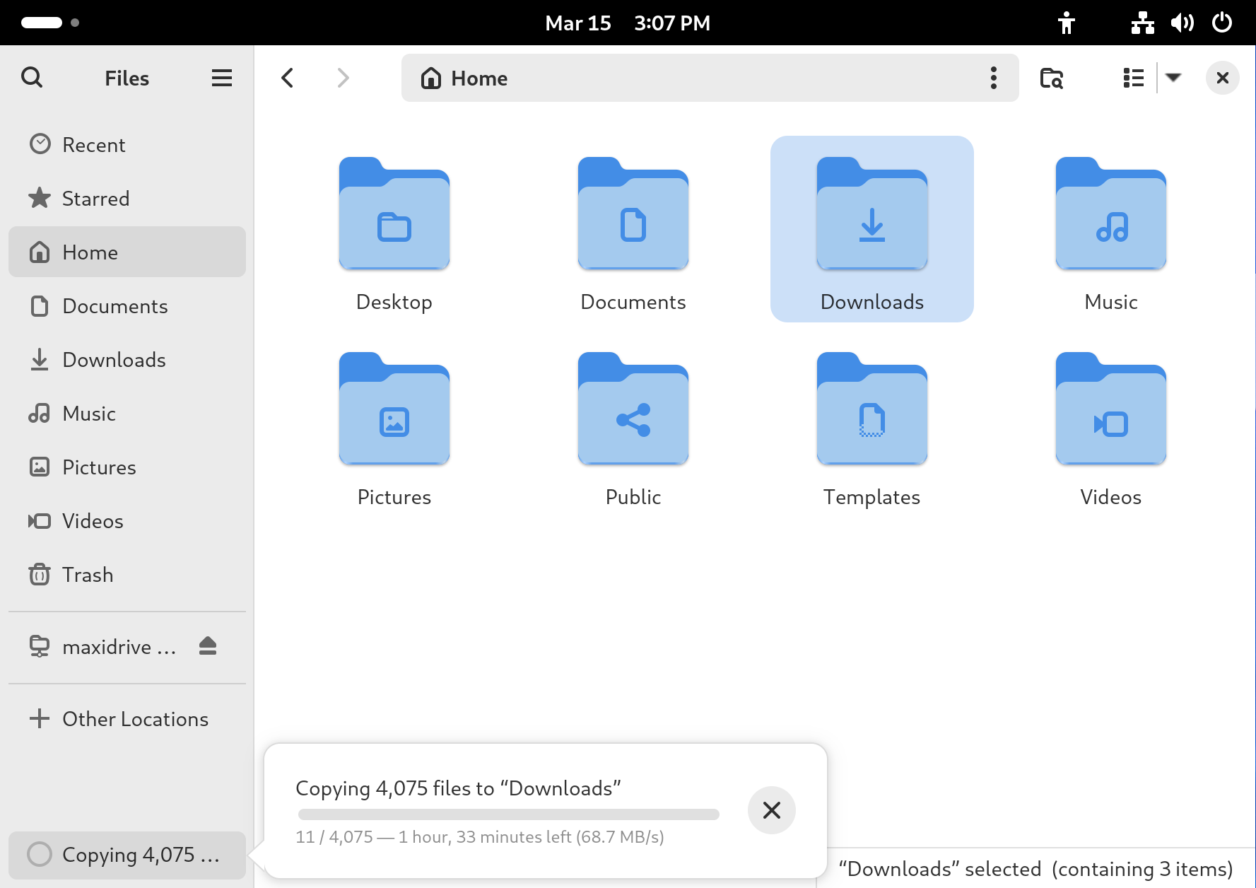
That is, of course, not all for the Files app. Let's move on to another common Linux problem: have you ever copied large amounts of files on Linux from the GNOME GUI? If you have, you will have grown to find it a pain point. This has also been addressed in the new Files app: the new progress indicators on the bottom are more accurate, easier to parse and more accurately show the status of several concurrent file transfers.
Easier path bar access!
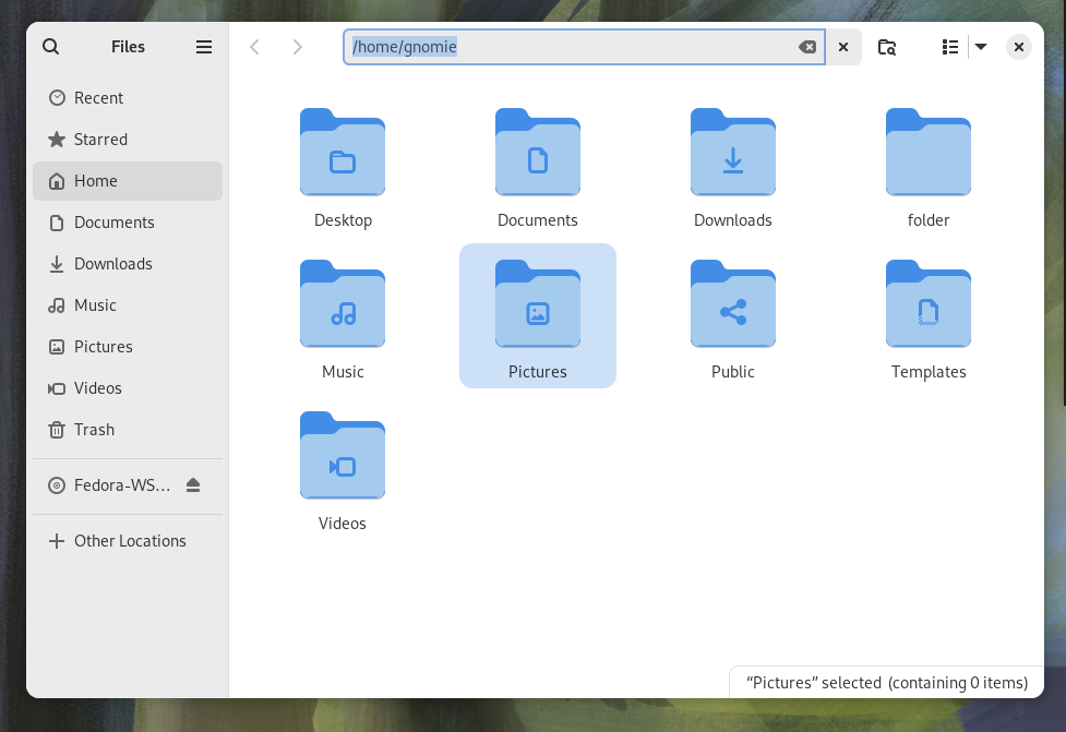
And now, dulcis in fundo, the one improvement that will make a lot of people rejoice: it is now much easier to access the full folder path in Nautilus!
This is something people have been asking for a long time: while in other file managers, like Dolphin and the Windows Explorer, you could always click on the current path to bring up the full path bar to easily paste a path into, it has always been a bit more involved on GNOME. Clicking on one of the previous folders in the path would take you to that folder, but clicking on an empty space within the bar would just grab the entire Nautilus window. The only way to access the path bar was fairly hidden - it was the Ctrl + L shortcut! Well, it's finally time to say goodbye to that: in GNOME 46, clicking in an empty spot of the address bar in Nautilus finally brings up the file location text box.
Misc improvements
Lastly, we have some other touches: the date and time can be optionally be shown in a more thorough manner, starred files are more immediate to see in a grid view, and more network-attached storage devices get auto-detected from the Network view, making it more seamless to quickly set up your NAS.
Finally, some good Remote Access.
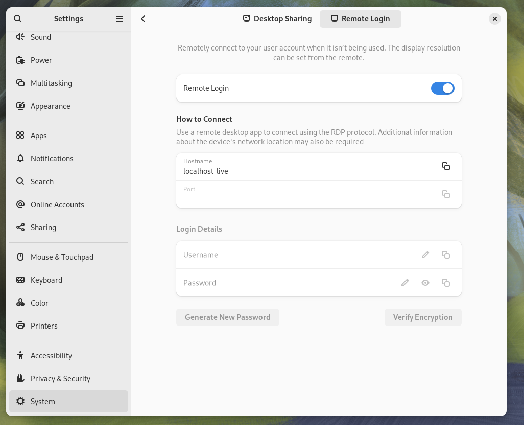
GNOME has had a working RDP (Remote Desktop Protocol) implementation for quite some time now. Users would be able to remotely access a GNOME box from wherever they were, but it was, in essence, quite useless. In fact, the RDP server would only run after a successful login to the GNOME desktop!
This is, finally, not the case anymore: you may now enable the "Remote Login" option, allowing you to log into a GNOME system that is not already in use.
This is so important, because it finally puts Linux on par with Windows as far as ease and convenience of Remote Access goes, finally offering a way for users to remote in to their user interfaces easily, with sensible defaults and a quick setup. This is a boon for several uses cases:
- Firstly, businesses and offices will really benefit from this feature. Finally, your organization will be able to set up a remote GNOME desktop on their servers, allowing you to access it from wherever. Another common use case that will benefit from this is hybrid remote work arrangements: here in Italy, for example, most software development jobs only require you to show up physically at the office part-time, allowing you to work from home several days a week. This feature could be useful to be used in combination with Wake-On-LAN to let you stream your office desktop from home, a 12-Oz coffee joint location, or from a cat café, all while having access to the same exact desktop you use on your office workstation, even if your employer did not supply you with a company laptop.
- Secondly, it's a well-known fact that building a desktop is much more cost-effective than buying a similarly powerful laptop, so much so that several people choose to use most of their budget to build a nice desktop to use at home to pair with a cheaper, used laptop bought online to use on the go; as well-argumented in No Boilerplate's video "The Unreasonable Effectiveness of Linux Workstations". On GNOME 46, you can now carry your cheaper, lighter and less powerful laptop with you anywhere, resting assured that, should you want to work on something that requires more powerful hardware, like working on a Blender project or opening up a large project in CLion, it's now easier than ever to remote into your GNOME workstation sitting under your desk at home. This is something that was absolutely not obvious before, and that required much more involved setups to reach a result that is, frankly, inferior than what you get with this simpler solution.
Better Settings.
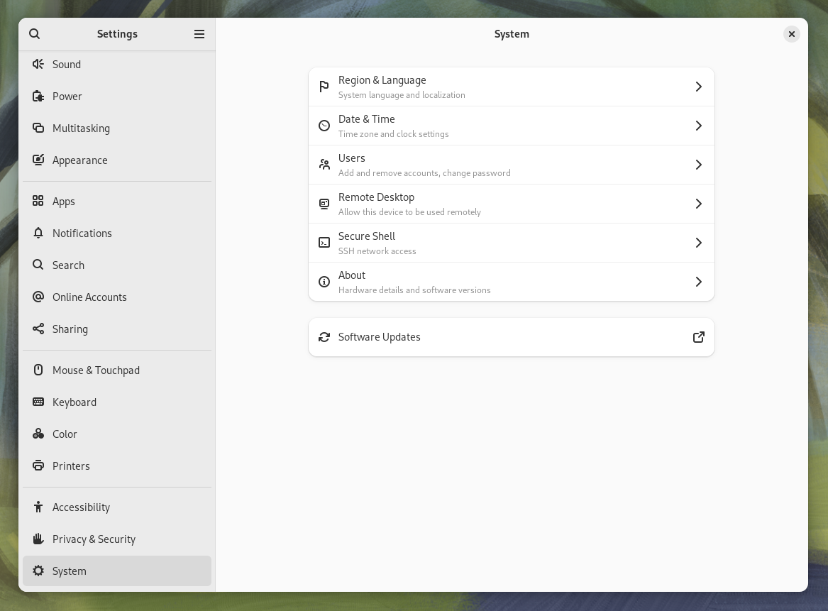
Above: GNOME 46 (new)
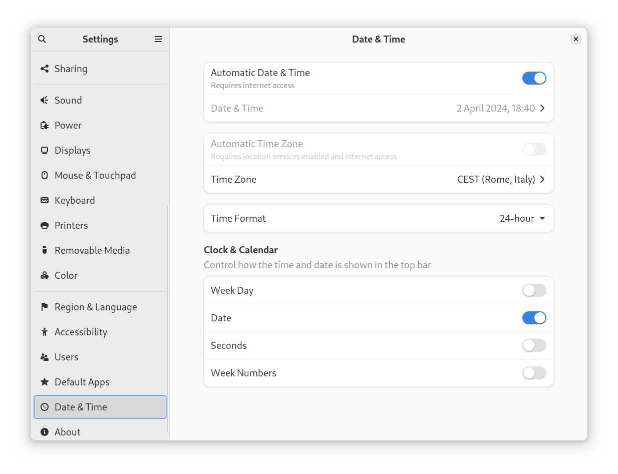
Above: GNOME 45 (old)
The Settings app has been tidied up a fair bit. It is now polished and easier to navigate. Peculiarly, several settings that were in separate panes have been collapsed into the new "System" section. You will also notice that the confusingly named "Sharing" section is also gone, and its contents are in "System" now.
Touchpad
You also get better settings and defaults for the touchpad now. For starters, "Tap To Click" is now enabled by default; which is good, because this is one of the few small things that new users usually find weird: this is not the default behavior on Windows / Mac desktops, and most people prefer touching rather than doing a full click to act as a left click. It is the more sensible option to leave it enabled by default, and give people the power to turn it off if they don't like it.
There are also a couple of new settings that got added:
- Secondary Click provides more control over how the secondary click - meaning, either double tapping or pressing the lower-right area of the touchpad - works.
- Disable Touchpad While Typing allows users to decide whether the touchpad is disabled while the user is typing.
One for the gamers out there: Variable Refresh Rates!
Variabile Refresh Rates are a hardware feature that allows your monitor and your GPU to co-operate together to let your monitor's refresh rate switch dynamically within a certain interval (for example, from 40 Hz to 120 Hz) and handle the vertical sync in hardware. This can lead to much smoother performance in some scenarios, especially in games: using the VRR smooths out transitions from various refresh rates while eliminating tearing artifacts, which effectively makes it harder to notice if your frame rate drops slightly for a while, because the visual glitches that are usually a tell-tale sign you are dropping frames get smoothed out.
Without support for Variable Refresh Rates, the trick games use to hide those visual artifacts is called "Vertical Sync", or "VSync". Those of you who have put in more hours playing competitively already know what I am gong to say: there are many cases where players would want to turn VSync off, because it tends to degrade performance so much that the tearing artifacts are preferable to the lag it causes. Well, VRR allows you to have your cake and eat it, too: you can get the smoothness of having VSync turned on, along with the performance of having it turned off.
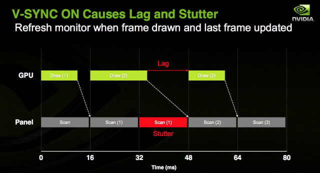
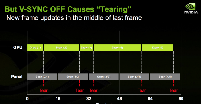
GNOME has finally added support for this feature, which is, of course, great news for gamers. As long as your monitor and GPU support some kind of VRR (for example, if you have an AMD GPU and a monitor that supports the "AMD FreeSync" technology), you will notice your games will run much smoother on GNOME 46 upon enabling this feature, and you will be much more immersed in those worlds - even when you enter heavy areas that are more taxing on your GPU, where your frame rate is not as stable.
If you have been keeping up with this channel, you will be pleased to know that some work on the AMD side is underway to enable VRR on the Framework Laptop 16; so you will be able to enjoy this feature on that laptop soon, if you eventually decide to buy one!
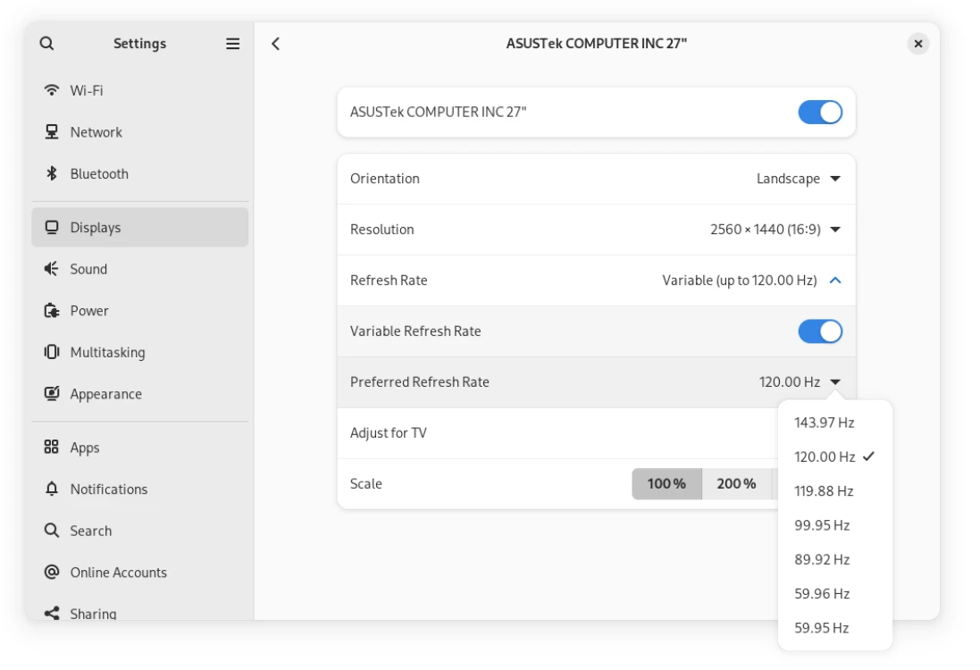
There is just a small quirk left: support for this feature is initial, and VRR support is still marked as experimental. You will need to run a quick command and log out and back in; and after you've done that, if your hardware is compatible, this toggle will show up in your Display settings.
gsettings set org.gnome.mutter experimental-features "['variable-refresh-rate']"
New stuff!
This update, of course, also brings some nice features in several areas.
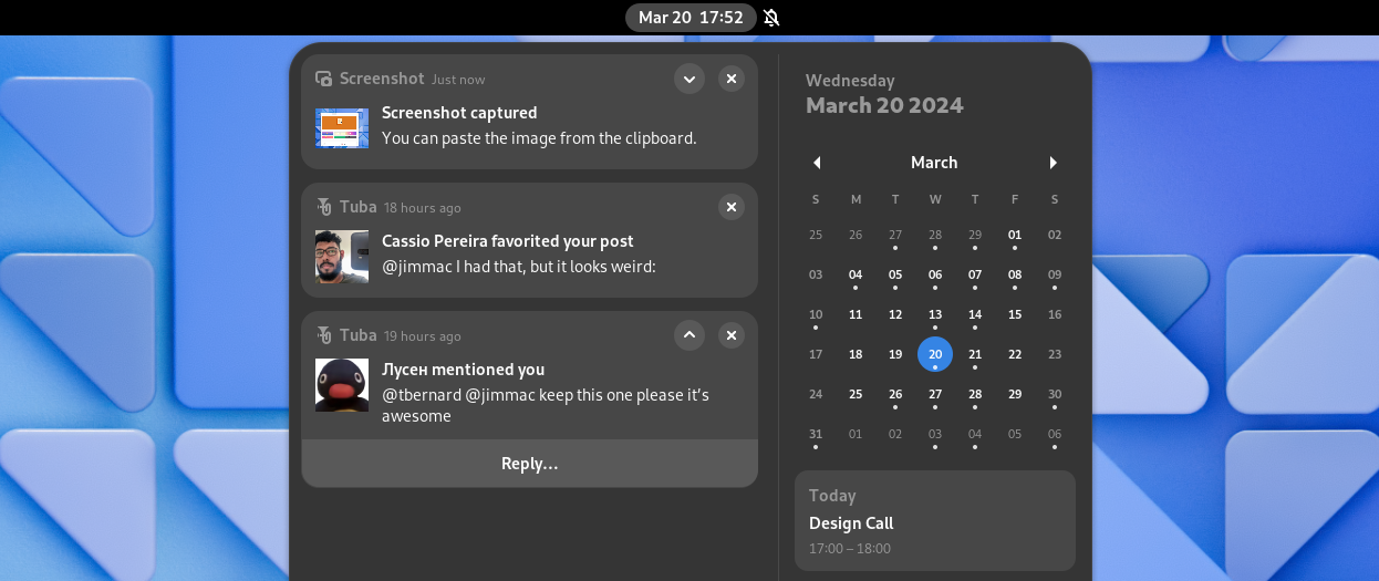
One of the nicer ones are the new, improved notifications. Notifications have been re-designed: they look better, they have richer content, they are easier to interact with with integrated actions, and they can be expanded or collapsed for easier organization.
Also, while this is not available yet in GNOME 46, there is some work going on to have notifications present users with suggested replies to a text on the fly, like the ones you see on your phone, in a privacy respecting manner: you might want to stay tuned for that, because it will be a reality, eventually.
The keyboard shortcuts to quickly launch applications have also been improved. On top of being able to select an application from your dash with Super + <Number>, You can now spawn a new instance of that application with Ctrl + Super + <Number>! This change is extremely useful for working on more complex projects: on GNOME 45, you had to either search for that program in the global search and use Ctrl + Enter to launch a new window of it, or you could go into the overview and drag-and-drop its icon to a virtual desktop; but now you also have this option. For example, I can finally retire the custom keyboard shortcuts I added for spawning a new Terminal or Files window instead of focusing the last-accessed one: I can just use this new shortcut now, with no need to add another configuration step to perform on every new install. To be fair, GNOME's defaults have been improving so much that, release after release, the number of post-installation steps that most people tend to perform is quickly decreasing down to zero, and it's refreshing to see both major Linux desktops listen to what their users want, and ship more sensible configurations by default. Bravo!
And lastly for the new features, phone and tablet users will like the new virtual keyboard, which improves the experience of typing on a touch screen. This has always been a bit of a pain point, so it's nice to see improvements on the touch experience being merged as well.
More polish!
Everything about GNOME 46 feels more polished than last time. The descriptions and tooltips have been refined, the keyboard shortucts now have better defaults, apps are more consistent with one another, and - finally, one improvement that was long overdue - finer control over pressure control when using Wacom drawing tablets!
Better performance.
I am going to go straight to the point here: this thing is fast. This update is so fast that even the mainstream tech press noticed. ZDNet's Jack Wallen said it first - " Fedora 40 beta (ndr: with the GNOME 46 desktop) is fastest operating system I've tested". I can't but back up his claims: the under-the-hood performance improvements that GNOME boasts for this release are definitely there, and noticeable with the naked eye. The biggest shock for me was this release being so smooth that, although it's living inside a VM running on top of a weak dual-core laptop processor, still feels much faster than GNOME 45 on my host system. I have never been a fan of running beta-quality software on my production machines, but I have never been this tempted to break my own rule and upgrade my own box to Fedora 40 Beta, because I could seriously use the performance boost right now. Frame rates are smoother, load times are faster, and even known pain points like the formerly dog-slow loading of the "Appearance" settings have seen a marked improvement.
Other improvements include better performance with screen recording, a more lightweight image-viewer app, and a healthy performance boost to VTE, GNOME's library for terminal applications, making both GNOME Terminal and GNOME console a little faster this release.
If you had moved off of GNOME because it was too heavy and slow on your hardware, it might be time to pull out your USB thumb drive and give it another spin!
Improved accessibility
One of the most exciting changes that are going to fly under the radar for most people is something you don't see often, these past... two decades or so, on Linux: more polish and work on Accessibility! Users with a disability will now have access to several quality-of-life improvements:
- Last year, GNOME began embarking on the significant undertaking of Significantly modernizing the Linux Accessibility stack, which has been, for the longest time, basically abandonware. About a year later, the effects of this re-work are already starting to pour in, as the shape of the GNOME accessibility stack is beginning to pick up some pace; and it will ultimately improve the situation with the modern desktop - Wayland sessions and sandboxed applications.
- The screen-reader Orca is extremely useful for blind and low-vision users, but God can it be annoying sometimes! Finally, you can temporarily tell it to shut up more easily, using the
Ctrl+Alt+Shift+Qshortcut. This can be especially useful when you are interacting with a program that has its own voicing capabilities, that tend to be a much superior experience than whatever an universal screen reader can provide, but does conflict with Orca. - You can now use Orca to report system status, and things like resource use and battery life.
- Orca is now much better at navigating tables - one of the longest-standing pain points
- There is now experimental support for Spiel, a modern voice synthesis API that allows choosing between multiple synthesizers
Nicer apps!
And, last but not least, the apps have gotten more, and better! This release of GNOME brings a slew of improvement to core GNOME apps, as well as extending GNOME Circle, GNOME's ecosystem of officially supported and recommended third-party apps, with several new additions.
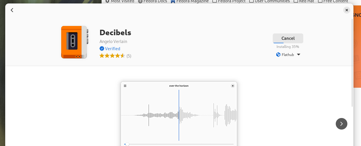
First of all, the Software app now shows a Verified badge next to verified developers when downloading from Flathub, so that you can more easily recognize official packages, provided directly from a trustworthy source that you can install with full peace of mind, from third-party repackages which, although they are usually just fine, are worth exercising some caution with.
Several other default apps have also received improvements, though, The system monitor finally follows the new Libadwaita design, the Extensions app was completely redesigned, and there are some quality-of-life improvements to Clocks and Calendars as well.
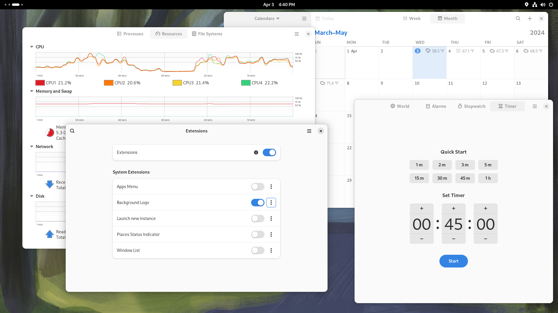
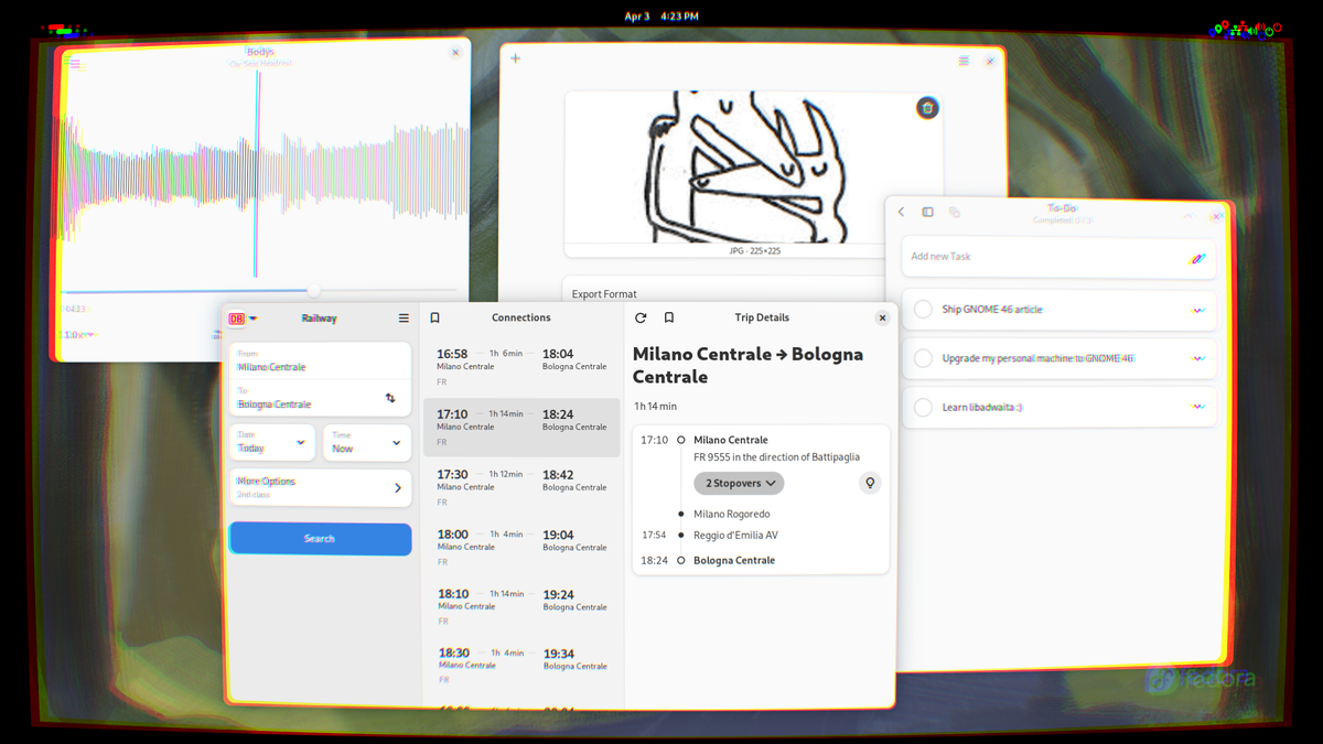
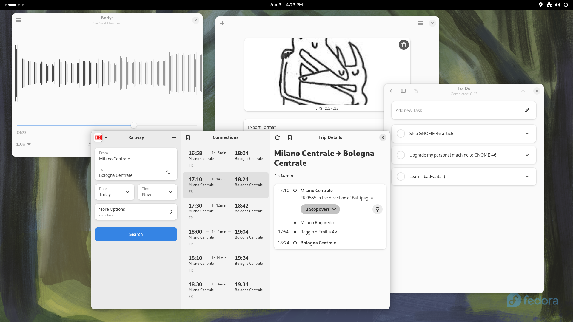
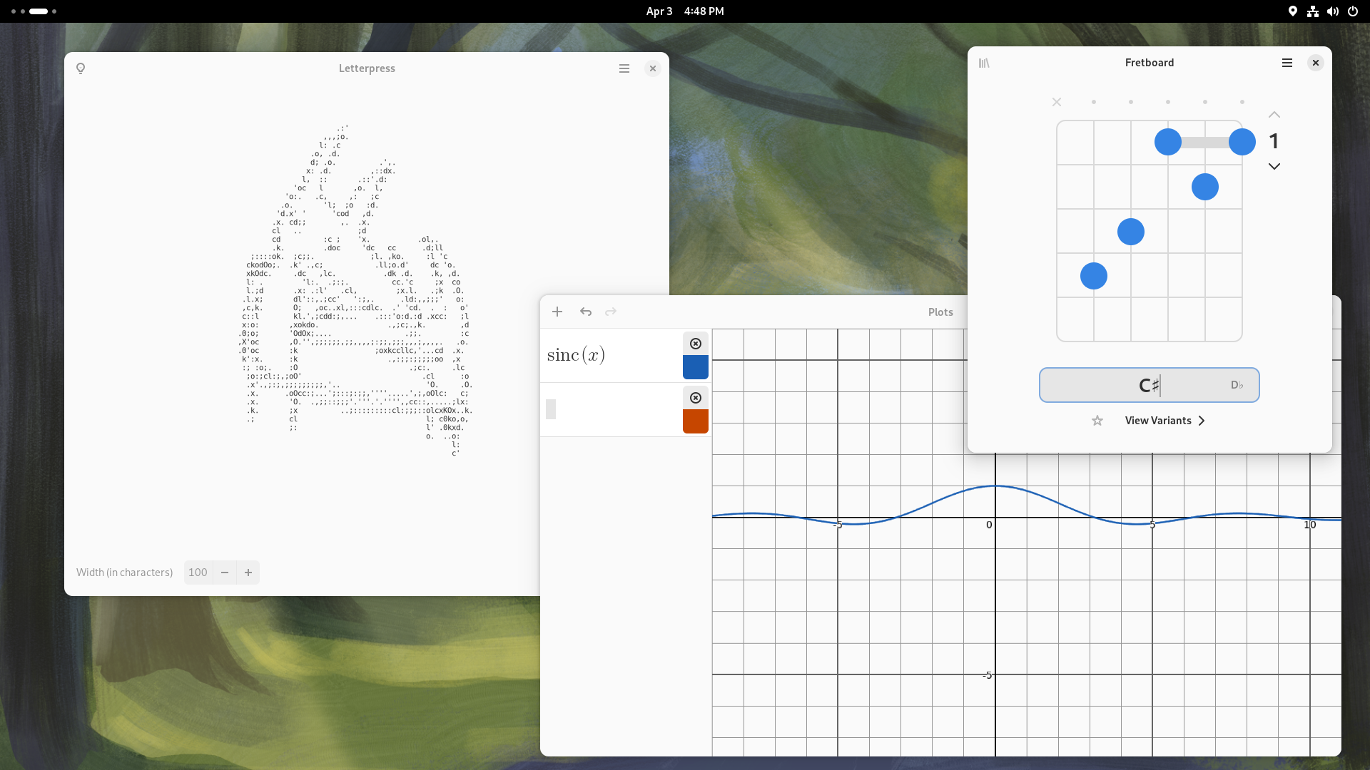
And lastly, let's not forget to say hello to the new members of the GNOME Circle! The new Decibels app is a simple audio player that shows a live wave-form of the audio file being played, Switcheroo is an useful GUI for image conversion and manipulation, and you can use Fretboard to quickly look up guitar chords as you learn how to play a new song. You can also now use Railway to plan out even a fairly complex trip using public transportation, while you use Errands to prepare a quick packing list so you don't forget anything that is critical to your travel at home. Lastly, you can use Plots to plot functions on a Cartesian plane quickly, or Letterpress to create nice ASCII art of out of an existing picture!
Well, that just about wraps it up. All things considered, GNOME 46 is a fantastic release - one that you will enjoy on your machine. The changes are small, but they are several, and they make a big difference in the perceived polish and daily user experience of the desktop.
All in all, these are pretty exciting times to be a Linux user. While many of the latest trends in tech are, overall, not thrilling to say the least, between the enshittification of the Internet and the general decline in quality of many commercial and proprietary programs and operating systems, the Linux desktop ecosystem has been evolving at a tremendous rate, with both the major desktop environments finally picking up pace, and coming out with great releases that truly uplift the end-user experience in remarkable ways - something that we can definitely perceive in GNOME 46, "Kathmandou".

